Pop-Ups
Customize the Pop-up templates using the code view
The code view gives access to the template's HTML and CSS code to make advanced customization. Use code view for making detailed visual tweaks that aren't possible using the UI options. The code view is available for any Pop-up template that you select. For more information on Pop-up templates, see Choose the Pop-up template.
Before you customize your template, as a best practice, create a backup copy of the code. This prevents any unexpected content loss.
Access the Code View of the template
Customize the template using the code view
Access the code view of the template
Use the following steps to access the code view of the Pop-up template:
- On the Pop-up edit screen, click the code view icon to access the template code.
 2. Once you've edited the code, click the play icon to preview the changes.
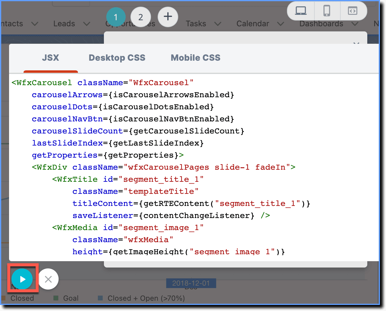
Customize the template using the code view
For Pop-ups created using Visual Editor, CSS selectors enable you to customize the various elements inside the Pop-up. For more information, see CSS Selectors.
The following table lists the different types of CSS Selectors available in the CSS code view, directly use the provided CSS selectors to make visual tweaks to the Pop-up template.
Additionally, other CSS Selectors can be identified within the Pop-up template using the Inspect Element for further customization.
| CSS Selector | Description & Examples | Corresponding HTML element |
|---|---|---|
| .popuptemplate-popupResizeBox | Container of .popupTemplateCard element. On resizing the Pop-up, width and height values are applied on this div. 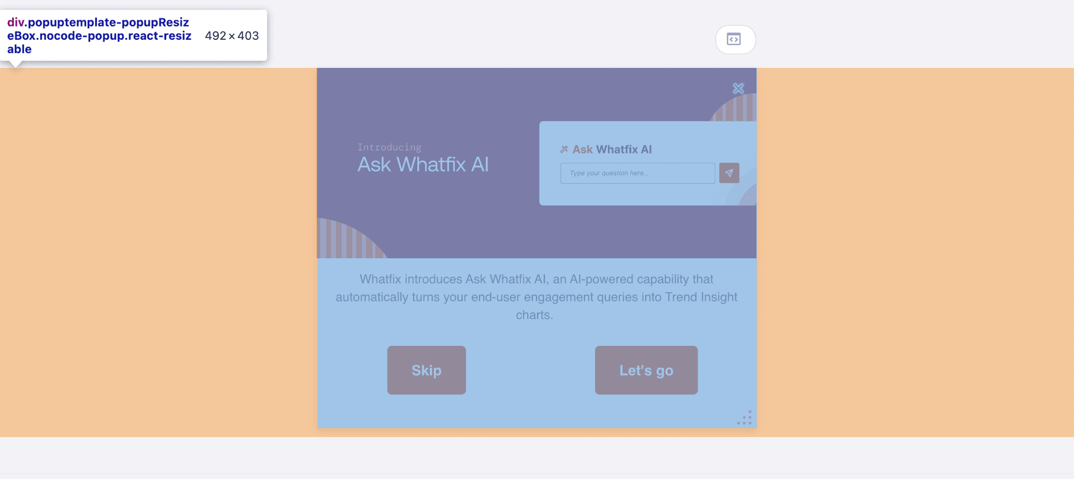 | class="popuptemplate-popupResizeBox nocode-popup react-resizable" |
| .popupTemplateCard | Container of .popupContainer element used for internal implementation.  | class="popupTemplateCard" |
| .popupContainer | Container of drag and drop layout along with the 'X' icon container, Don't show me again container, Carousel Dots and Carousel Arrows. Pop-up background color and image are applied on this component.  | class="popupContainer" |
| #popupClosePanel | Container for 'X' icon on Pop-up. 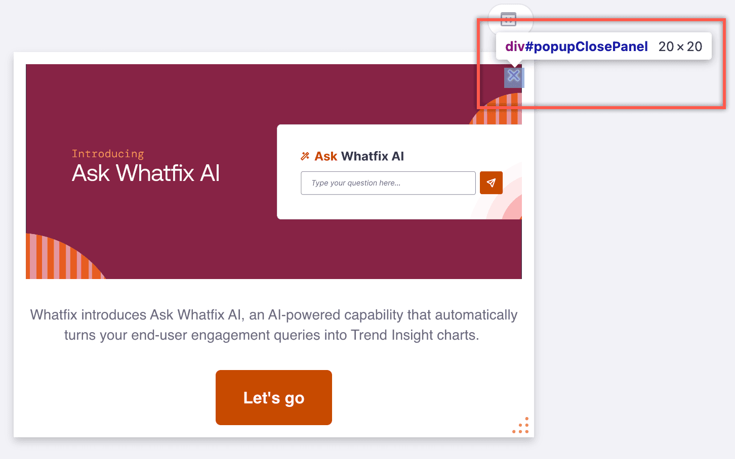 | id="popupClosePanel" |
| #popupDontShowPanel | Container for Don't show me again checkbox. 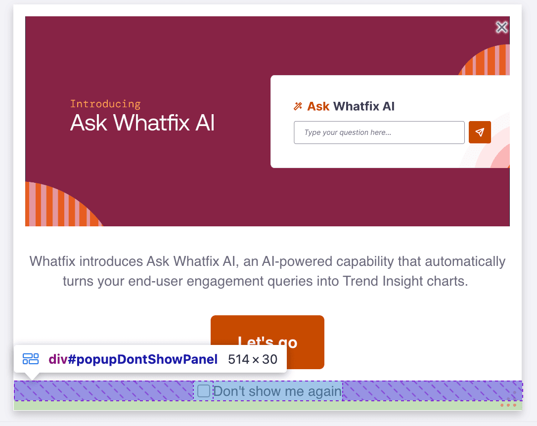 | id="popupDontShowPanel" |
| #popupDotNavButton | Container for Carousel Dots. 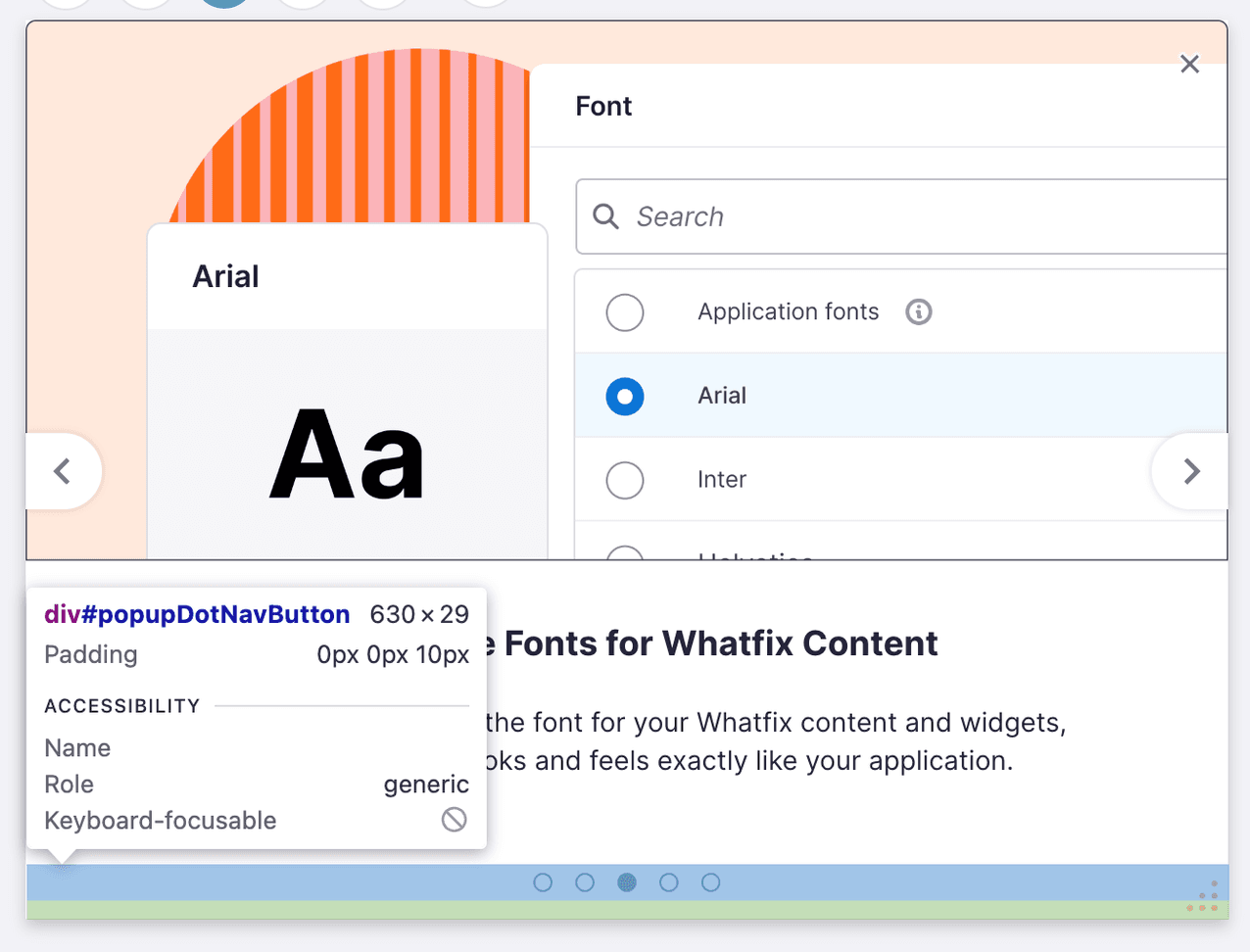 | id="popupDotNavButton" |
| #popupLeftNavButton | Container for Pop-up left arrow button. 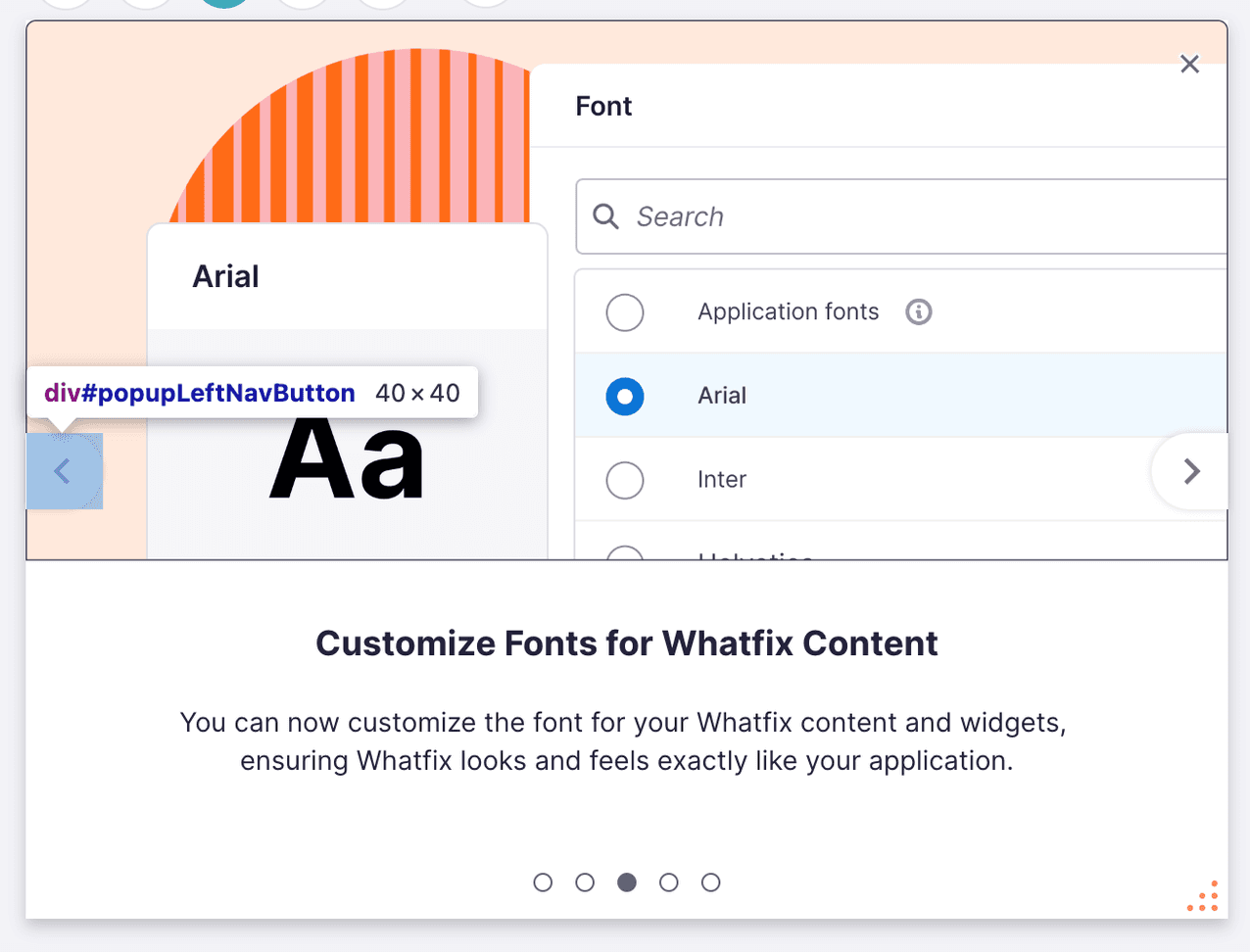 | id="popupLeftNavButton" |
| #popupRightNavButton | Container for Pop-up right arrow button. 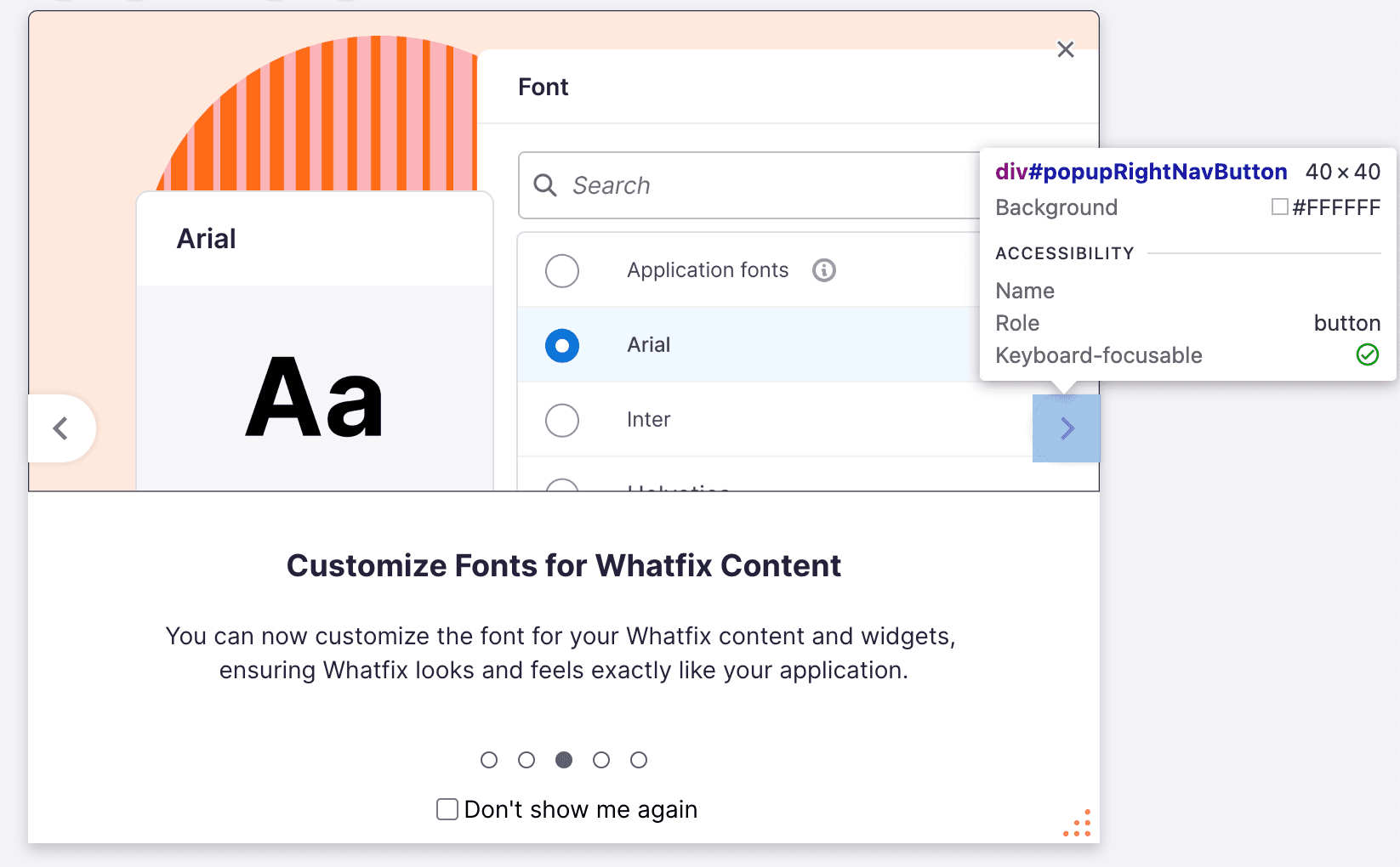 | id="popupRightNavButton" |
| #noCodeWidgetContainer | Container of drag and drop layout inside a Pop-up. 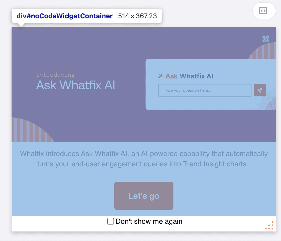 | id="popupDontShowPanel" |
| .wfx-row | Indicates that the current div is a row. 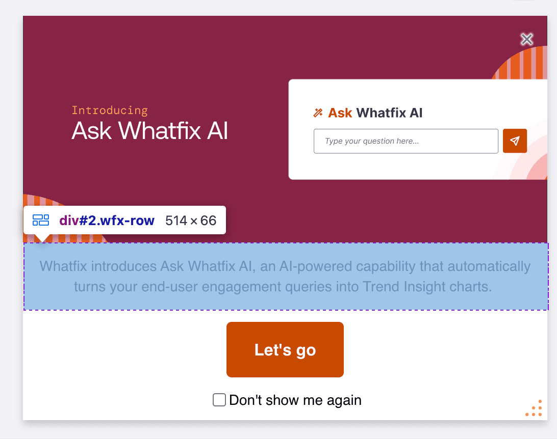 | class="wfx-row" |
| .wfx-column | Indicates that the current div is a column.  | class="wfx-column" |
| .wfx-card | Container of drag indicator and component. 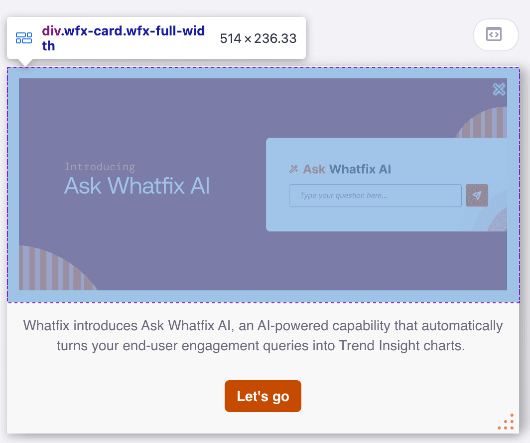 | class="wfx-card" |
| .wfx-safe-area | Indicates that the current div is safe area container around components. 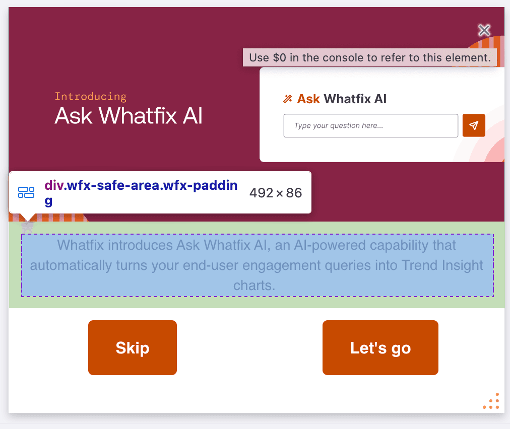 | class="wfx-safe-area" |
| .wfx-padding | 12px padding around components. 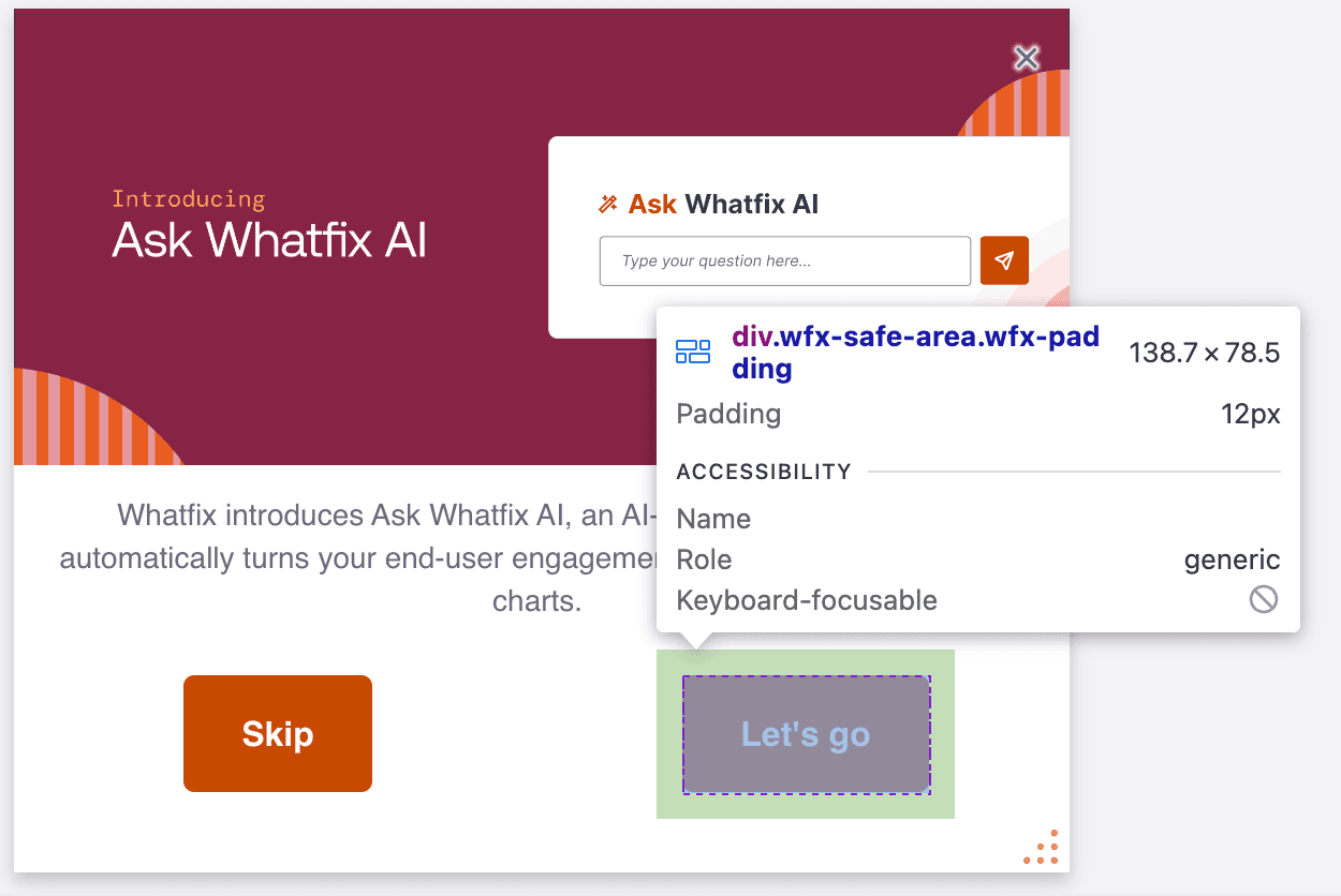 | class="wfx-padding" |
| .wfx-full-width | Indicator placed for 100% width container of a component. This is used for ignore safe area functionality. | class="wfx-full-width" |
| .wfxButtonText | Container for button text. 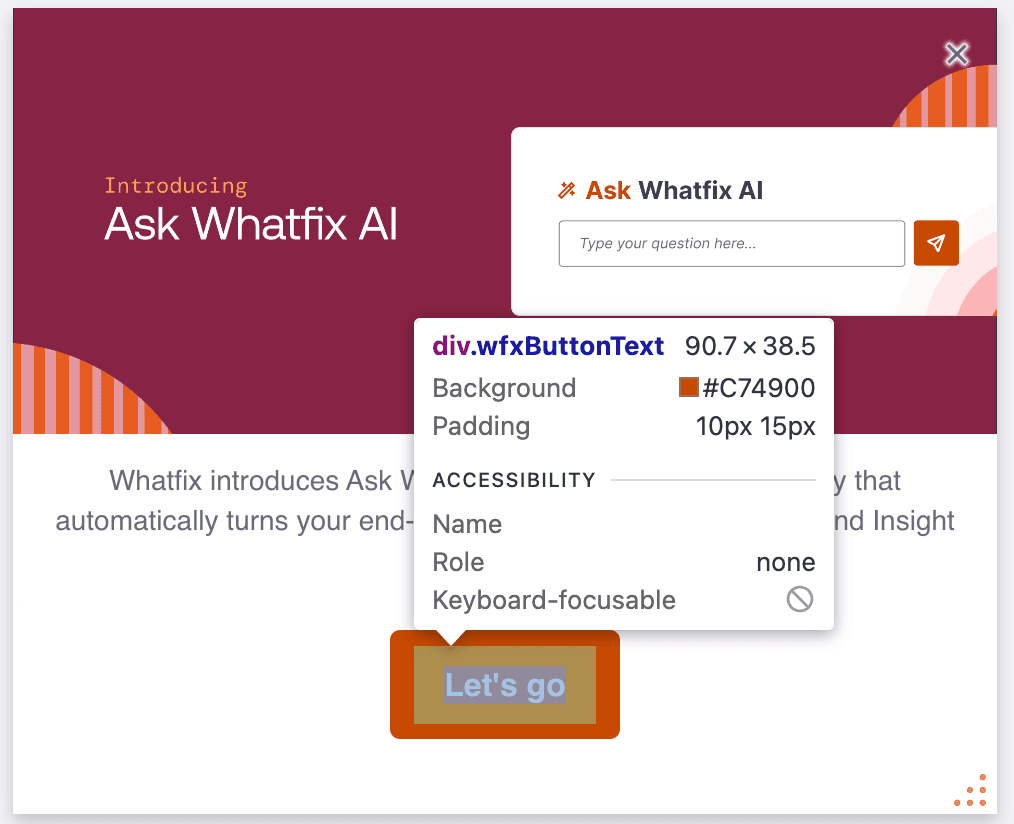 | class="wfxButtonText" |
| CSS Attribute Selector | Description |
|---|---|
| [data-wfx-slide="1"] | Associates a unique integer id with each carousel slide. In the given sample selector, the unique id associated with the current slide is 1. |
| [data-wfx-dnd-element="1-3-2-textField"] for carousel | Acts as an identifier for a component in carousel. Format: "slide-row-column-component" The sample selector [data-wfx-dnd-element="1-3-2-textField"] indicates that current element is in 1st slide, 3rd row, 2nd column and it is a textField. Supported values for component are textField, image, button, video, audio. |
| [data-wfx-dnd-element="1-2-textField"] for non-carousel popups | Acts as an identifier for a component in non-carousel Pop-ups. Format: "row-column-component" The sample selector [data-wfx-dnd-element="1-2-textField"] indicates that current element is in 1st row, 2nd column and it is a textField. Supported values for component are textField, image, button, video, audio. |
Use Cases
Change the text color
The following CSS code styles all <p> elements on the Pop-up.
p {
  color: #8B0000;
  text-align: justify;
}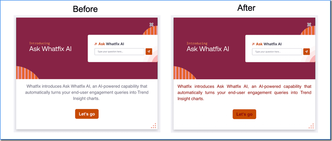
Before code changes:
- By default, the paragraph text is aligned to the center.
- The paragraph text color is set to #6B697D.
After code changes:
- Paragraph text is justified, that is, it's evenly spread across the width of the container.
- The color of the text is changed to dark red (#8B0000)
Customize the Button
The following CSS code styles the elements with the class .wfxButtonText.
.wfxButtonText {
  font-size: 16px;
  padding: 10px 15px;
}
Before code changes:
The text inside the Button had a default font size and padding.
After code changes:
font-size: 16px;: This line sets the font size of the text inside elements with the class .wfxButtonText to 16 pixels.padding: 10px 15px;: This line sets the padding of elements within the class .wfxButtonText. Padding adds space around the content of an element. Here, 10px of padding is applied to the top and bottom, and 15px of padding is applied to the left and right.
Customize the slide color
The following CSS code targets elements with the attribute “data-wfx-slide” set to the value "2" and applies the following styles to those elements.
[data-wfx-slide="2"] {
  background-color: #f0f0f0;
  border: 1px solid #ccc;
  padding: 10px;
  margin: 5px;
}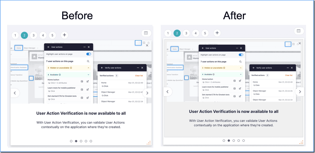
Before code changes:
The slide with the value “2” had a default background color, border, padding, and margin.
After code changes:
background-color: #f0f0f0;: The slide’s background color is set to a light gray (#f0f0f0).border: 1px solid #ccc;: Adds a border of 1 pixel width with a light gray (#ccc) color.padding: 10px;: Adds padding of 10 pixels to all sides of the element.margin: 5px;: Adds margin of 5 pixels to all sides of the element.