Best Practices
Launchers Best Practices
Add Launchers to a Launcher collection
A Launcher once created must always be a part of a Launcher collection for it to reflect on the page or application. A Launcher collection is a group of Launchers belonging to the same page. For more information, see Add a Launcher to an existing collection.
Create one or two Launchers per page
It is recommended to limit the number of Launchers to one or two per page. For more information, see Create a Launcher.
Visibility rules are defined for the Launcher Collection. So even if you have only one Launcher on a page, it needs to be part of a collection.
Create one Launcher collection per page
Whatfix evaluates only one Launcher collection at any given time. If two or more Launcher collections exist on the same page of an application, then only one of them is evaluated.
When editing or modifying a particular page to add a new Launcher, look for any existing Launcher collection for that page. Do not create a new Launcher collection for a page if the collection already exists.
For more information, see Adding a Launcher to an existing collection.
The criteria for evaluation depends on the visibility settings or the number of conditions (in case visibility settings are the same for two segments).
Provide URL paths for Launcher Segment across application environments
If you want the same Launcher segment to work across application environments, then provide URL paths instead of the complete URLs. If this is not done, the Launcher segment in one environment may not work in another. 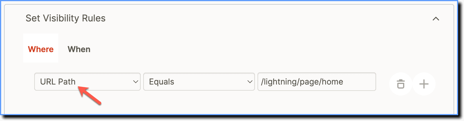
Look for existing Launcher collections on a page
When editing or modifying a particular page to add new Launchers, look for any existing Launcher collection for that page. Don't create a new Launcher collection for a page if the collection already exists.
Choose an appropriate button style for the Launcher
Select different button styles for a Launcher to suit the underlying application. Choose between Filled (Primary) button, Secondary (Outlined) button, and Text button styles based on your use case.
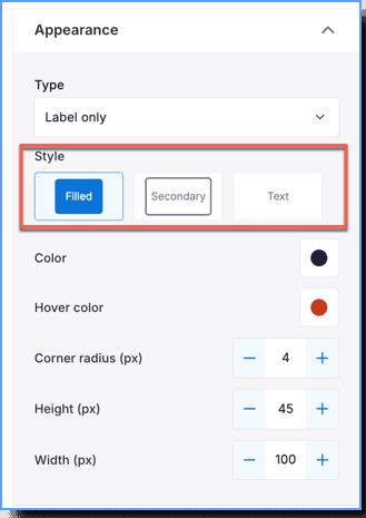
For more information, see Customize a Launcher.
Provide clear and concise text for the Launcher
Keep the text in the Launcher short. The text of the Launcher should give the end user clarity on the information rather than being something generic.
Place Launchers contextually
Place the Launcher where the end user will most need it on the application, and not in a generic location. If there's a dashboard or homepage, place a Launcher that launches a Flow to guide users through key features or updates.
Preview the Launcher before pushing it to Production
Once you are done creating a Launcher, test the Launcher in the Preview mode before publishing it. Ensure that it appears in the correct location.
For more information, see Preview a Launcher.
A visually prominent button that represents the primary action on a page. It has a filled background, an outline, and text that draws users' attention.
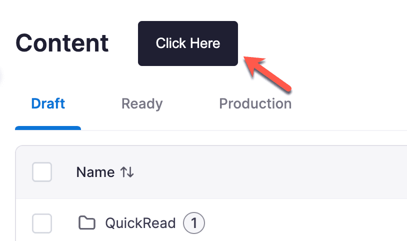
Text buttons are represented as text links and are used for less important actions than Primary and Secondary buttons. It has no background color or outline, just the text itself.